Zaggy: A Display Font for Elegant Digital Branding
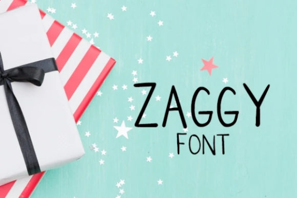
As a UI designer who ships dozens of landing pages, SaaS dashboards, and e-commerce experiences each year, I don’t reach for display fonts lightly. They’re not background players—they’re tone-setters. That’s why Zaggy stands out: it’s a display font built for digital clarity without sacrificing character. It walks the line between authentic calligraphy and refined elegance—fluid enough to feel human, structured enough to hold up in responsive layouts.
Zaggy isn’t a script font that sacrifices legibility for flair. Its letterforms have intentional spacing, open counters, and consistent stroke contrast—details that matter when scaling from a 48px hero headline on desktop down to a 36px mobile banner. The curves are smooth but controlled; the terminals are tapered, not abrupt. That balance makes Zaggy perform well where many decorative fonts falter: over image overlays, on dark mode interfaces, and alongside minimalist UI components.
Where Zaggy Earns Its Place in Your Layout
In practice, Zaggy shines in high-impact, low-text contexts. Think of it as your brand’s visual handshake—not the full conversation, but the first impression that lingers. Use it for:
- Hero section headlines on portfolio sites or creative agency landing pages—especially when paired with ample whitespace and a restrained sans serif body font;
- Product name treatments in online stores selling premium goods (think artisan ceramics, boutique skincare, or limited-edition prints);
- Course or workshop titles on education platforms—its warmth supports trust without undermining authority;
- Logo lockups or wordmarks for brands prioritizing approachability and craftsmanship (e.g., coaching services, independent publishers, design studios);
- Section dividers or decorative accents in blog layouts—like a subtle “Chapter” label or an elegant pull quote marker.
Avoid using Zaggy for body copy, navigation labels, or small CTAs under 20px. It’s not designed for dense reading—but that’s by intention. Its strength lies in guiding the eye, establishing hierarchy, and reinforcing brand voice in seconds.
Readability & Responsiveness: What You’ll Actually See on Screen
Zaggy renders cleanly across modern browsers and devices. On mobile, it holds its shape at 32–40px—even with modest letter-spacing adjustments. For dark backgrounds, increase tracking slightly and use a soft white or off-white (not pure #FFFFFF) to reduce glare. Over imagery, apply a subtle semi-transparent overlay or text shadow (e.g., text-shadow: 0 1px 4px rgba(0,0,0,0.3)) to ensure contrast meets WCAG AA standards.
It includes OpenType features like stylistic alternates and ligatures—useful for fine-tuning rhythm in short phrases (“Handcrafted”, “Est. 2021”, “New Collection”). These aren’t gimmicks; they help avoid awkward collisions (like “f” + “l” or “t” + “y”) and add subtle polish to branded microcopy.
Smart Pairing for Digital Consistency
Zaggy thrives when paired with a neutral, highly legible companion. For most web projects, I default to a clean, variable sans serif—like Inter, Manrope, or IBM Plex Sans. Their even x-height and generous apertures create breathing room around Zaggy’s expressive forms. This pairing delivers both personality and practicality: Zaggy sets the tone; the sans serif carries the message.
For editorial or luxury-facing sites (a literary magazine, a fine art gallery, or a heritage brand), try pairing Zaggy with a warm, low-contrast serif like Cormorant Garamond or Literata. The serif adds gravitas; Zaggy adds distinction—without competing. Avoid pairing it with other script or handwritten fonts; the result feels cluttered, not curated.
Licensing, Formats & Real-World Deployment
Zaggy is delivered as a premium font with full webfont support—including WOFF2, WOFF, and EOT variants—so you can self-host confidently. It includes Latin multilingual coverage (Western, Central, and Eastern European characters), making it viable for bilingual SaaS dashboards or global e-commerce banners.
Importantly, its commercial license covers use in client websites, SaaS platforms, online stores (Shopify, WooCommerce), digital templates (Figma UI kits, Notion brand systems), and downloadable assets like PDF workbooks or email headers. Just ensure you’re licensed for the number of domains or active installations—standard practice for any professional-grade display font.
If you’re building a brand kit for a client, include Zaggy in your typography guidelines with clear usage rules: “Zaggy is reserved for primary headlines, logo variations, and branded graphic elements. All interface text, buttons, and body copy use [Sans Serif Name].” That kind of specificity prevents misuse—and preserves Zaggy’s impact.
Why This Matters Beyond Aesthetics
Typography isn’t decoration—it’s behavioral design. Zaggy’s elegance signals care, attention to detail, and intentionality. Users subconsciously associate those qualities with your product or service. On a coaching site, that builds credibility before the first sentence is read. On a boutique store, it reinforces perceived value—justifying premium pricing. In a course sales page, it creates emotional resonance that supports conversion, not just clicks.
But none of that works if the font feels tacked on. Zaggy earns its place when it’s part of a deliberate system—not a one-off flourish. Use it where users pause, scan, and decide: the hero, the value proposition, the CTA headline. Let it echo in your favicon treatment or email subject lines. Keep it consistent across social graphics and digital ads. That repetition builds recognition faster than any logo alone.
At its core, Zaggy is a tool for confident digital storytelling—one that respects both the craft of typography and the reality of how people interact with screens today. It doesn’t shout. It invites. And in an interface landscape full of sameness, that quiet distinction is exactly what your brand needs.