Hobart: A Friendly Handwritten Display Font for Digital Brands
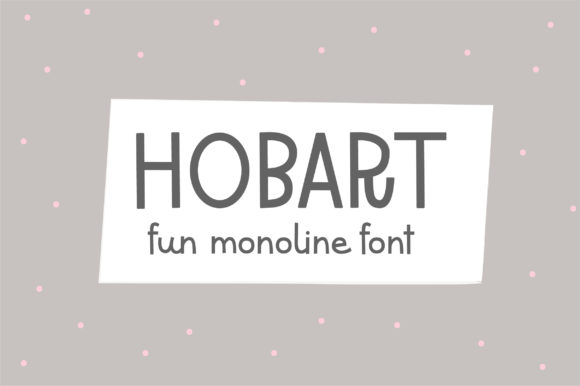
As a UI designer who ships landing pages, SaaS dashboards, and e-commerce experiences daily, I pay close attention to how typography shapes perception before a single word is read. Hobart stands out—not as a workhorse body font, but as a display font with genuine warmth and approachability. It’s a clean, casual handwritten typeface that avoids the overly ornate or rigid constraints of traditional calligraphy scripts. Instead, Hobart balances rhythm, spacing, and subtle variation in stroke weight to feel human—not hurried, not stiff, and never artificial.
In practice, Hobart excels where personality matters most: hero section headlines, product name treatments, CTA buttons on conversion-focused layouts, and brand-driven content sections. Its friendly tone supports creative portfolios, boutique online stores, wellness coaching sites, and indie course platforms—any digital space where authenticity and emotional resonance directly influence trust and engagement. Because it’s designed as a display font, Hobart performs best at larger sizes (24px and up), especially against high-contrast backgrounds. On mobile, it remains legible in headers when sized appropriately—think 28–36px on iOS Safari and Chrome Android—and benefits from generous letter-spacing (0.5–1.2px) to preserve its open, airy cadence.
Visual hierarchy is where Hobart shines without competing. Used sparingly—as a primary headline over a neutral sans serif body font like Inter, Poppins, or Manrope—it creates instant contrast and focus. That pairing isn’t just aesthetically sound; it’s functionally strategic. Your users scan first, then read. Hobart captures attention in under two seconds. The supporting sans serif ensures clarity, scannability, and accessibility for longer-form content. For editorial-leaning digital products—like a newsletter site or a knowledge base—you might pair Hobart with a warm serif (e.g., Cormorant Garamond or Playfair Display) to add sophistication while retaining approachability.
Hobart works exceptionally well in contexts where brand voice must feel personal yet polished. Imagine a handmade ceramics shop’s homepage banner: “Hand-thrown in Portland” set in Hobart over a soft beige background, with product descriptions in a crisp, lightweight sans serif. Or a mindfulness app’s onboarding screen: “Breathe in. Breathe out.” in Hobart, followed by concise instructions in 16px system font. These aren’t decorative flourishes—they’re intentional tonal anchors. Hobart signals care, craft, and calm—qualities that translate directly into perceived brand reliability and user comfort.
It’s important to note what Hobart isn’t designed for: dense paragraphs, small interface labels, or data-dense tables. Its charm lies in brevity and intention. Use it for short phrases, logo lockups (especially for lifestyle or creative brands), social media banners, email headers, and branded digital ads. Avoid stacking multiple weights—Hobart is typically offered in a single upright style, sometimes with alternate characters or ligatures. Check your license: most premium font providers include webfont files (WOFF2 optimized), CSS snippets, and usage rights for live websites, client projects, SaaS apps, and digital templates. Commercial licensing covers embedding via @font-face, using in Figma design systems, and exporting branded assets—but always verify multilingual support if your audience spans Latin, Greek, or Cyrillic scripts.
On dark mode interfaces, Hobart maintains readability with sufficient contrast—aim for at least 4.5:1 against #121212 or #1a1a1a backgrounds. When layered over imagery, use a subtle semi-transparent overlay or text shadow (1px black at 30% opacity) to ensure legibility without dulling its organic texture. For buttons, Hobart scales cleanly at 18–22px with tight tracking (–0.25px) and ample padding—just avoid all-caps usage, which flattens its natural flow. And while it’s expressive, it’s not overly playful: Hobart feels mature enough for finance-adjacent tools (e.g., budgeting coaches or freelance invoicing platforms) when paired thoughtfully with restrained layout and color.
Real-world examples reinforce its versatility. A freelance illustrator uses Hobart for her portfolio site’s navigation tagline (“Sketches, Stories, Solutions”)—immediately signaling creativity without sacrificing professionalism. A plant-based meal kit startup applies it to weekly menu headers (“This Week’s Harvest”), giving seasonal freshness visual weight. An online writing course deploys Hobart in email subject lines and lesson titles (“Find Your Voice”—not “Module 3: Tone & Cadence”), increasing open rates and completion signals through tone consistency alone.
Font pairing isn’t theoretical—it’s operational. In Figma or Webflow, I’ll often set Hobart as the H1 style token and assign a variable sans serif (like Recursive or IBM Plex Sans) for all other typographic roles. This keeps the design system scalable and the brand voice unmistakable across devices. If you’re building a brand kit for clients, include Hobart as the primary display font alongside clear usage guidelines: max two lines per use, minimum size thresholds, approved background combinations, and prohibited contexts (e.g., legal disclaimers or error messages).
Finally, remember that typography is part of your product’s behavior—not just its appearance. Hobart doesn’t just look friendly; it invites interaction. When users see it in a CTA like “Start Your Free Trial”, the handwritten rhythm subconsciously lowers friction. That’s not magic—it’s deliberate type choice aligned with user psychology and digital context. Choose Hobart when your goal isn’t just to inform, but to connect—to make your digital experience feel less like an interface and more like a conversation.